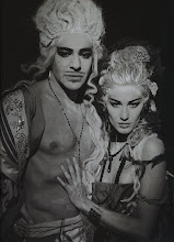
 The fact that Biba managed to get away with an advert where the model isn’t even wearing their clothes, speaks volumes about the brand and the strong visual identity it created. This advert was created in 1974 for the brand right before it collapsed and left the highstreet, after its roaring success in the 60’s. To me, this iconic image, even without the logo in the top left (not to mention the presence of actual Biba clothing), screams Biba: the sumptuous, velvety colours; the heavily kohled eyes; the Twiggy-thin model (before the days of heroin chic of course); the overall darkness with shots of jewel tones. Biba’s owner/founder Barbara Hulanicki described Biba’s palette as consisting of "Auntie Colours", further relating the look to that of a funeral. I’m all about the auntie by way of a funeral look! Call me crazy, but I think this is one of the best and most fitting fashion campaigns created. A shame it marked the end of the company’s initial run.
Biba’s aesthetic is one I am greatly fond of, and not because I am particularly fond of the 60’s/ early 70’s fashion offerings. What appeals to me is not the clothes/accessories of Biba per se (I’m sure they had some lovely pieces), but it’s the brands sensibility and overall aesthetic I am drawn to, in particular the logo. It’s gold and black, it’s art nouveau, ergo, its fabulous. You may have guessed this from my outfit posts, but I‘m not a fan of the sparse, simplistic, minimalist look. No way. For me, if it’s intricate, ornate and over the top, I am bound to love it. I like decoration, elaboration and patternisation (I made the latter word up). I’m only slightly ashamed to admit that the last two books I read were bought on the basis that they had beautifully elaborate patterns on their covers. (Yes, I judged a book by its cover, but more often than not, a cover is indicative of contents, so I’m not going to lose sleep over it!)

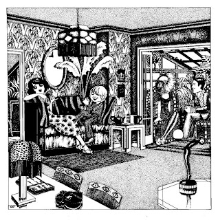
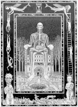
So anyway, the art nouveau logo, the art deco inspired fonts and posters, the colours…all lovely things I like about Biba. Biba had a whole ethos built around it, a unique style, that transcended the clothes. The gold and black art nouveau Biba style is instantly recognisable; the logo was reconfigured in all manner of ways and added to the range of Biba products, including the stores themselves. Just look at the interior of this store! It’s definitely somewhere you would have found me were I around at the time. According to Wikipedia (the fount of all knowledge) the logo’s designer Antony Little painted the Biba sign above the shop and blacked out all the windows so that the store’s interior didn’t receive any sunlight, vital for the Biba’s art nouveau atmosphere. Whist doing the Google rounds on all things Biba, I happened to find these illustrations by Malcolm Bird, which serve as further examples of the Biba ‘look’. He was employed by Hulanicki as a pattern cutter and colourist, supplied illustrations for publicity and designed the children’s department in one of the Biba shops. I absolutely love these illustrations, and am reminded of the work of the Victorian illustrator Aubrey Beardsley, whose beautiful work I have been in awe of for years. You can barely see it, but on the Biba logo is just visible on the ladies cosmetics on her dressing table, and on the back wall of the living room, next to the young mans head.

 So getting to the point of this post (yeah there is one)….we have established that I love Biba (even the luke-warmly received relaunch in 2006), I love art nouveau patterns… and I love tooled leather (two main reasons why I love my Liberty of London art nouveau Ianthe print tooled leather handbag). I also happen to love shoes. So when I found a pair of Biba shoes, with the logos art nouveau print in tooled and perforated leather, I knew I wouldn’t be happy until I owned them. Art Nouveau…. Tooled Leather… High Heels… Must possess, that was pretty much all my brain thought about for weeks. When they finally arrived last week, I was over the moon and beside myself with giddiness at the sight of such beautiful creatures. Shoes are like my babies, and this pair are special as the mark the 60th pair in my collection. Yay for shoes. They’re pretty delicate, and the potential scuff risk is high. I can tell I will hardly ever wear these, they’re the sort of shoe that is for display, as I would never forgive myself if I scuffed them or damaged them in anyway (something I’m good at doing, i.e. falling down a flight of stairs during rush hour in front of about 1000 commuters on my way down to catch the tube wearing my Chloé shoes. Ouch.) I just have to note that the flash from my camera has lightened the shoes considerably. They are black, and where the leather has been tooled, the background is a dark brown. The flash does serve to highlight the pattern though, which is fine by me.
Since I’ve had them I’ve been meaning to try them out with some coloured tights, to gauge how good the effect is. Well tonight, I finally got round to doing it, and the verdict is…reasonably good! My red tights are my brightest pair, and I do love how they look with the shoes, just peeking through a little. I’ll let the photos do the talking since I’ve done enough of that already.








.jpg)


1 comment:
best shoes EVER!!
Post a Comment